
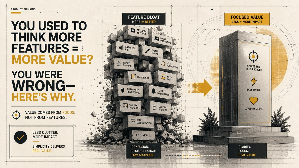
You used to think more features = more value? You were wrong. Here's why

Feature bloat reduces user satisfaction and loyalty. Learn why products that prioritize simplicity and purposeful features create better user experiences and stronger retention.
Understanding Feature Bloat and Its Impact
Feature bloat occurs when a product is loaded with excessive functionality that complicates its use rather than streamlining it. This problem is common in technology and software. Companies often add features in response to competitor offerings, believing these additions increase product value. In practice, many consumers use only a small fraction of those features.
Research from the Nielsen Norman Group shows that users often feel overwhelmed by too many options. Their findings indicate that cognitive overload reduces user satisfaction and increases abandonment rates [1]. Features intended to add value can instead create barriers to usability.
Apple has long been a leading example of limiting feature bloat. Its emphasis on simplicity and ease of use shows how intentional design builds user loyalty. The company's products maintain a reputation for being user friendly while still providing the functions most people need.
Research indicates that interfaces cluttered with options can reduce conversion rates, and many software features see little or no regular use [1]. Extra options often create barriers rather than benefits for users.
The Case for Simplicity
Simplicity in product design creates a better user experience. Users value products that solve problems without unnecessary distractions. GoPro cameras illustrate this idea through streamlined designs focused on ease of use. They include the core features users expect while keeping the interface straightforward enough to capture high-quality content without navigating complex settings.
Research also shows that users return more often to products that are easy to use. A study discussed in the Journal of Usability Studies found that users who enjoyed a product experience consistently valued simplicity and intuitive design [2]. Usability strengthens customer satisfaction and builds brand loyalty. Complex products often experience higher churn because users switch to simpler alternatives.
Simple designs reduce cognitive load and increase the likelihood that users return. Products that solve one clear problem well often outperform those that attempt to solve many problems poorly.
The Value of Purposeful Features
Avoiding feature bloat does not mean removing useful functionality. Purposeful features add value when they align with real user needs. The focus belongs on quality rather than quantity. Identifying the core functions users need helps every feature serve a clear purpose.
Trello is a good example of this principle. Its minimalist interface allows users to organize work without feeling overwhelmed by endless options [3]. When deciding which features to build, companies should prioritize those that provide measurable value and help users accomplish their goals.
| Product | Approach | Result |
|---|---|---|
| Apple | Cut product line and focused on core ease of use | Strong loyalty and high margins |
| Trello | Minimalist boards and cards | Fast adoption without training |
| Netflix | Recommendations instead of long browsing lists | Higher engagement and lower abandonment |
| Warby Parker | Home try-on with simple selection | Differentiation in crowded retail |
These examples show that purposeful choices improve satisfaction more than long feature lists.
Real-World Examples of Design Simplicity
Real-world examples support the idea that simplicity improves user satisfaction. Netflix focuses on content discovery through a streamlined interface. Instead of overwhelming users with choices, the platform recommends content based on viewing history [4]. This focus on personalization increases engagement while keeping the experience simple.
Warby Parker also delivers a straightforward shopping experience. Customers can select and try on glasses at home while receiving support when needed. This focus on user experience and purposeful features helps the company stand out in a crowded market.
Apple's return under Steve Jobs included reducing its product lineup to a more focused range. The result was clearer product messaging and stronger customer loyalty. The same principle appears across the examples above.
Why Some Still Argue for More Features
A common argument says buyers choose the product with the longest feature list because it appears more capable. Longer lists often signal power and completeness. Buyers sometimes select the option that promises more, even though they later use only a small portion of those capabilities.
That argument reflects buying behavior in some markets. Daily use tells a different story. Unused features increase friction, support requests, and abandonment. Retention suffers when products overwhelm users with choices. Companies that study actual usage instead of feature comparison charts keep the functions customers value and remove the rest.
Reevaluating Product Value Assessment
Understanding product value matters because consumers face more choices than ever. The temptation to prioritize long feature lists should be balanced with user-centered design. Companies succeed when they solve customer problems in the simplest way possible.
Consumer research shows that many people prefer products that save time and simplify daily tasks. Product decisions should focus on real user needs instead of adding features for comparison charts. McKinsey reports that many consumers favor brands that improve convenience and save time [5].
Companies should continue listening carefully to customer feedback. Understanding how people actually use a product allows brands to create streamlined experiences that build lasting loyalty.
The balance between form and function sits at the center of successful product design. Businesses that prioritize clarity and usability create products people enjoy using.
FAQ
How do I know if a feature is purposeful or bloat?
Test whether the feature solves a clear user goal that existing tools do not already cover. Track actual usage after launch. Features that remain unused by most users belong on the cut list.
Does simplicity mean removing all advanced options?
No. Advanced options can remain available for power users when they stay out of the primary workflow. The main interface should serve most users without adding unnecessary steps.
Will cutting features hurt sales against competitors?
Purchase decisions sometimes favor longer feature lists. Long-term retention and referrals favor products that stay easy to use. Usage data and support requests reveal the real cost of feature bloat.
How can teams resist pressure to add every requested feature?
Set clear criteria tied to user goals and measurable impact. Require evidence of need before approving a new feature. Shared priorities keep decisions consistent across the team.
What role does customer feedback play in fighting bloat?
Watching how people use the product provides stronger evidence than collecting feature requests alone. Monitor abandonment points and support requests to identify friction caused by unnecessary options.
Brands that embrace simplicity and prioritize user experience create products that users return to and recommend.
References
[1] Nielsen Norman Group — Choice Overload Impedes User Decision-Making: https://www.nngroup.com/videos/choice-overload/
[2] Kubra — Why Simplicity and Speed Matter in Modern User Interface Design: https://www.kubra.com/blog/why-simplicity-and-speed-matter-in-modern-user-interface-design
[3] Trello — Boost Your Productivity with Trello: https://trello.com/
[4] Harvard Business Review — Netflix Knows What You Like: https://aiinstitute.hbs.edu/platform-digit/submission/netflix-knows-what-you-like/
[5] McKinsey & Company — Insights on Consumer Behavior: https://www.mckinsey.com/capabilities/growth-marketing-and-sales/our-insights/consumer-insights-and-analytics
Comments
Be the first to comment.
Related reads
When Not to Automate: Understanding AI Automation Limitations
Automating a broken process only accelerates failure. Before implementing AI, it’s crucial to stabilize operations, define accountability, and assess risks.

Preparing Your Team for Web AI Design Shifts: Prioritizing User Experience
In the face of rapidly evolving AI and web design technologies, prioritize user experience over simply adopting the latest tools. Discover how to prepare your team for these essential shifts.