Traffic lands, then backs out
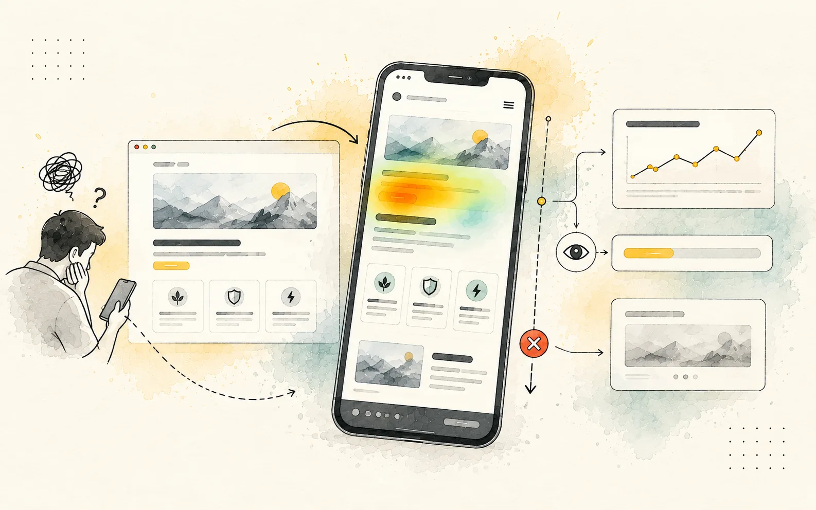
Landing never earns the scroll
Hero says everything and nothing. No clear next step, so mobile users never reach the first meaningful action.
We map where people quit, prototype what to change, and hand dev a system — not a pile of PNGs.








Unclear hierarchy, bloated flows, and specs that never survived build — we start where session replay stops.
Why clients leave
Pinned from analytics + session replay
Traffic lands, then backs out
Hero says everything and nothing. No clear next step, so mobile users never reach the first meaningful action.
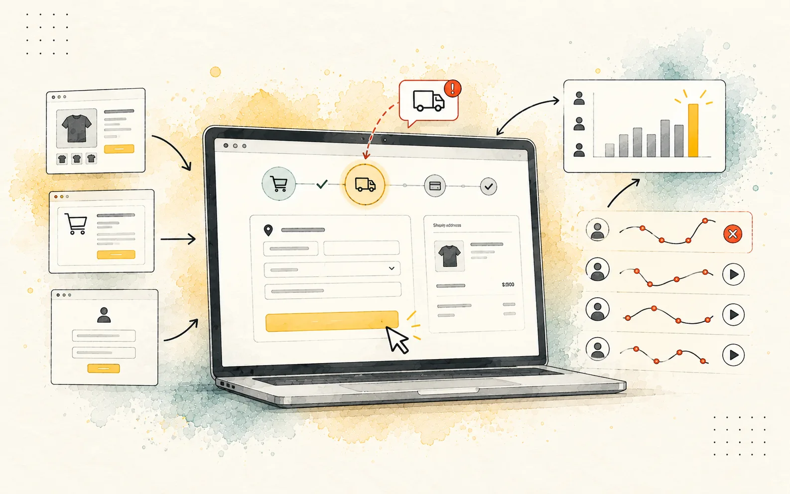
Cart abandons mid-flow
Extra fields and surprise shipping show up after intent is highest. The deck version of the flow is not what people experience.
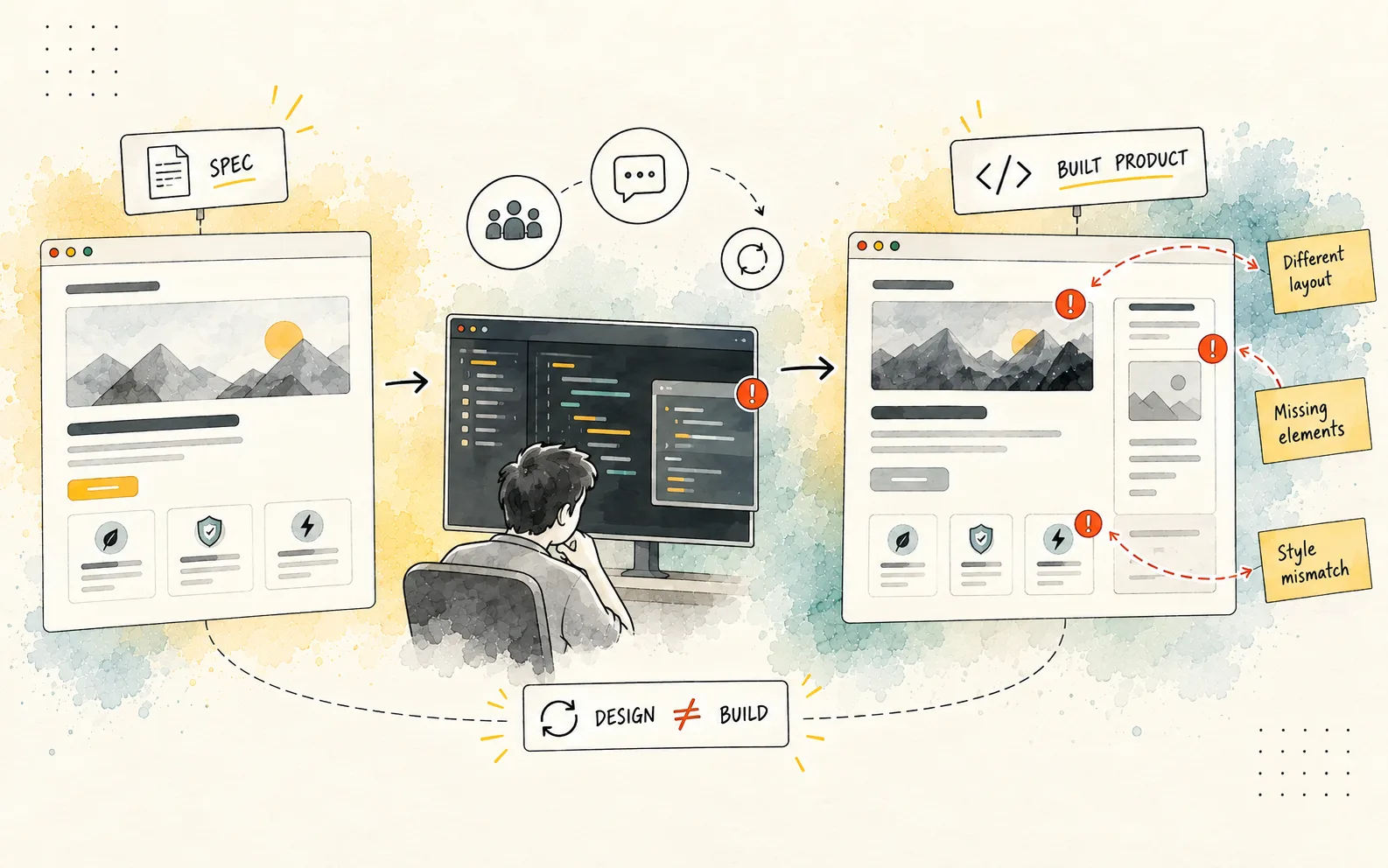
Build drifts from the spec
Spacing tokens, states, and edge cases never made it into the file. Engineering guesses; QA logs design debt as bugs.
Typography, spacing, and layout rules live in one file — not scattered across Slack screenshots.
Properties
Type scale tied to real content lengths — not one-off hero sizes.
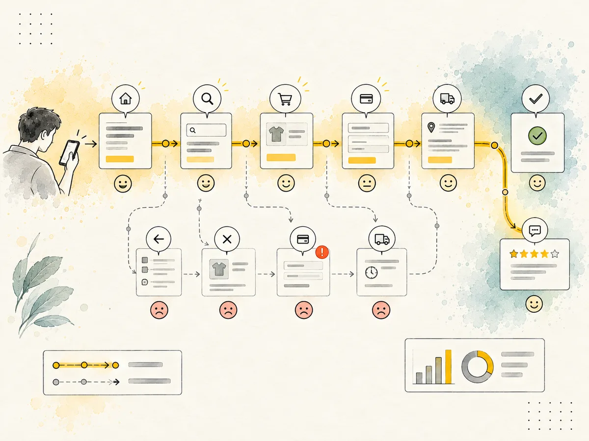
We document where users stall, then frame the UI your team can implement.
Steps from first visit to conversion — with drop-offs and sentiment marked before we change a single screen.
Breakpoints, components, and states on one board — so design, dev, and QA are looking at the same product.
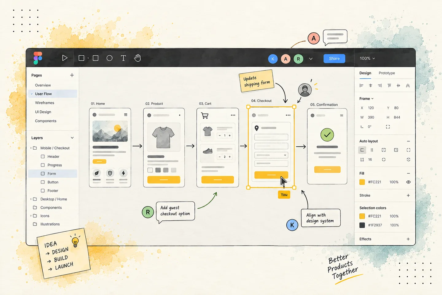
Research and handoff aren’t side quests — they’re on the same map as the UI.
Analytics, support tickets, and session patterns — we find where people stall before we sketch.
Information hierarchy, key flows, and component inventory — structure before pixels.
Clickable paths on real breakpoints — test with stakeholders before engineering commits.
Tokens, specs, and redlines in dev-ready format — fewer “can you check Figma again?” loops.
Direct benchmarks from production handoffs and live conversion flows.
Design tokens · component specs
Frontend handoff speed
3x
faster frontend implementation
Explicit tokens, interactive states, and responsive rules eliminate guesswork and back-and-forth QA loops.
Friction audits · flow redesign
Checkout & lead funnels
+38%
average completion rate
Streamlined steps and mobile-first layouts reduce drop-offs across purchase and registration flows.
Design systems · responsive states
Production readiness
100%
breakpoint & state coverage
Every screen includes hover, focus, error, and empty states across mobile, tablet, and desktop viewports.
“Great to work with. Very skillful. Not a lot of UXUI designers have aesthetic and visual design taste like Website Vikreta!”

Fiona Li
Senior Product Designer & Manager
“They were very professional. Team was timely, design was great and they did above and beyond my request.”

Stacey Bae
Developer, Archmodal Classrooms
“They understood exactly what I wanted and gave it to me. Very stylish designs and also does a lot of research to make sure the work is perfect. I'll recommend them not only because their work is good but they are easy going. They listen to you, they co-operate & communicated.”

Benoit Marcell
Owner, Elevagechiotspug
“They have excellent design skills. They quickly prototyped the design I had in mind and then programmed it using modern CSS3/HTML5/SVG technologies. They adjusted well with changing requirements as we iterated through the design work. I look forward to working with Website Vikreta again and highly recommend them for your next frontend project.”

Abhinav Singh
Co-founder, JAXL, India
“Website Vikreta did really nice work. They have really fast hands. They finished our new website design in the given time. They always responded quickly and has a really good sense of design. I will rehire them for future projects for sure.”

John Kim
CEO, Champion Lenders
Share analytics, a recording, or a live URL. We’ll reply with what we’d test first — no deck required.
Free call. No pitch. Tell us what's broken, and we'll tell you what we'd do.Free call. No commitment. Tell us what you're building, or what isn't working, and we'll tell you what we'd actually do about it. Not a pitch. Just a conversation.
Services